Most custom playing card orders that go wrong do not fail at the printing press. They fail on the design brief and the order form, in decisions made before anyone hits submit. The good news is that the expensive mistakes are predictable, which means they are avoidable. Here are the five that trip up first-time buyers most often, and what to do instead so the deck that arrives matches the one in your head.
Mistake 1: Sending artwork with no bleed or safe margin
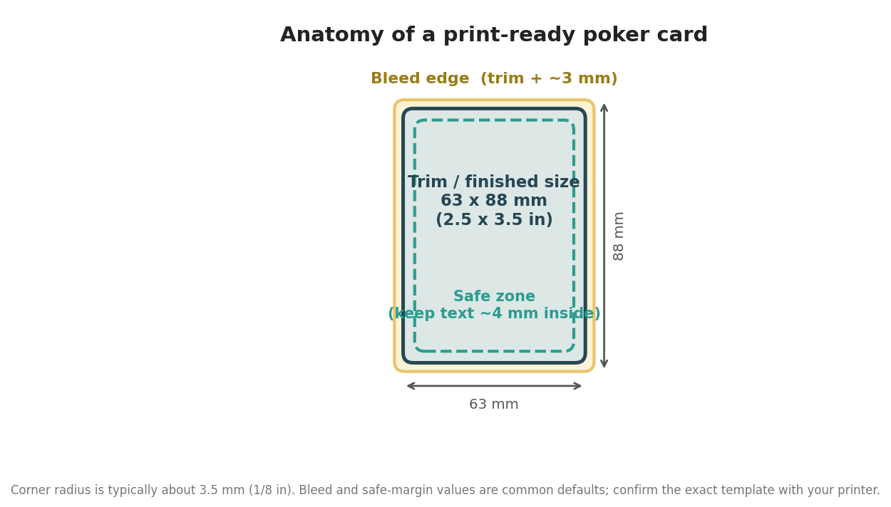
The most common and most painful error is treating the card as if the edge of your design is the edge of the card. It is not. A standard poker card finishes at 63 by 88 millimeters, or 2.5 by 3.5 inches, but every card is printed slightly oversized and then cut, and the cut wanders by a fraction of a millimeter. If your background stops exactly at the finished size, some cards come back with a thin white sliver on one edge. The fix is to extend any background or full-bleed art about 2 to 3 millimeters past the trim on all sides, and to pull important elements, text, logos, and faces, roughly 4 millimeters inside the trim so nothing critical gets clipped. Remember the corners are rounded, typically at about a 3.5 millimeter radius, so keep artwork out of the very corners too. The diagram below shows the three zones every card template is built around.
Mistake 2: Choosing the wrong stock and finish for how the deck will be used
Buyers often pick a stock by name without thinking about how the deck will be handled. The two most common weights are a 300 gsm premium smooth stock and a 310 gsm casino-grade linen stock, and the right one depends entirely on use. A deck meant to be shuffled and dealt for hours, at a game night, a casino promotion, or a serious card game, wants a linen or air-cushion finish, which has a fine texture that lets cards slide over each other and spring cleanly. A deck built to show off vivid photography or artwork often looks best on a smoother, glossier finish, at the cost of a slicker, more slippery handle. Just as important is the core: quality cards use a black or blue core layer in the middle of the stock that stops light passing through, so opponents cannot read a card from the back under bright light. Skimp on the core and a photo-heavy deck can turn faintly see-through.
Mistake 3: A back design that quietly marks the deck
This one catches people who care about design more than gameplay. If the back artwork is not symmetrical, top to bottom and left to right, then a sharp-eyed player can tell which way a card is oriented, and a deck that reveals orientation is effectively a marked deck. A crest that sits slightly high, a border that is thicker on one side, or a one-way pattern all leak information. Unless you specifically want a novelty or a deliberately one-way back, design the back to be fully rotationally symmetric, center it precisely, and keep any border an even width all the way around. It is a five-minute check in the artwork stage that is impossible to fix once 1,000 decks are printed. If you are unsure, print a single sheet, rotate a few cards, and see whether you can spot the difference; if you can, so can a player.
Mistake 4: Ordering below the volume where the cost per deck makes sense
Custom decks are a classic economy-of-scale product, and ordering a token quantity is the fastest way to overpay per deck. At Get Custom Playing Cards the minimum order is 12 decks, which is the right size for proving the print and the box, but the cost per deck falls steeply once the order reaches the quantities a bar chain, a hotel group or a publisher needs, because bulk pricing tiers apply as the run grows. The lesson is not to over-order, but to run the numbers: if you expect to need more decks within a year, a single larger run is almost always cheaper per deck than two small ones. Ask for a quote at two quantities and compare the cost per deck before you decide.
Mistake 5: Treating the tuck box and proof as afterthoughts
The last two mistakes are about the finish line. The tuck box is the first thing a customer sees, and it is a separate specification from the cards: stock, finish, and any embossing or foil all need to be called out, and it adds a real amount to the per-deck cost, as the pricing above shows. Design it with the same care as the cards, not as a plain sleeve slapped on at the end. Finally, do not skip the proof. Colors shift between the bright RGB of your screen and the CMYK inks on card stock, and a rich blue or a specific brand red can land noticeably different in print. Request a physical or pre-production proof before the full run, check the color, the cut, and the finish in your own hands, and only then approve. The figures and tolerances here are indicative industry norms and vary by supplier, so use them to interrogate a quote rather than as fixed guarantees. Get these five right and the odds of a deck you are proud of go way up.