Every custom deck starts with two decisions that shape how the finished cards feel in a player’s hands: the card size and the stock they are printed on. Get them right and the deck shuffles cleanly, fans smoothly, and survives hundreds of hands. Get them wrong and even a beautiful face design feels cheap or awkward. The size question almost always comes down to poker versus bridge, and the gap between them is a single quarter inch of width that changes far more than the number suggests.
Poker size vs. bridge size: a quarter inch that changes the game
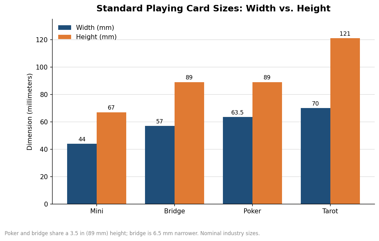
Poker-size cards measure 2.5 by 3.5 inches, or roughly 63.5 by 88.9 mm. Bridge-size cards keep the same 3.5-inch height but narrow the width to 2.25 inches, about 57 by 89 mm. That 6.5 mm difference in width is the entire distinction, and it exists for a practical reason: how many cards a player holds at once. When you fan thirteen cards in a bridge hand, a quarter inch of extra width per card adds up fast, which is why the narrower bridge size became the tournament standard for trick-taking games where hands are large.
Poker size wins everywhere hands are small and the face needs to be seen. In Texas hold’em you hold two cards, so the wider card gives pips and custom artwork more room to breathe and read across a table. Magicians tend to prefer poker size for the same reason, and most promotional or collectible decks default to it because the larger face is simply a bigger canvas for a brand or illustration. If you are printing a deck for general play or for its looks, poker size is the safe default; reserve bridge size for card games that genuinely involve holding a large hand.
Weight, thickness, and why the core matters
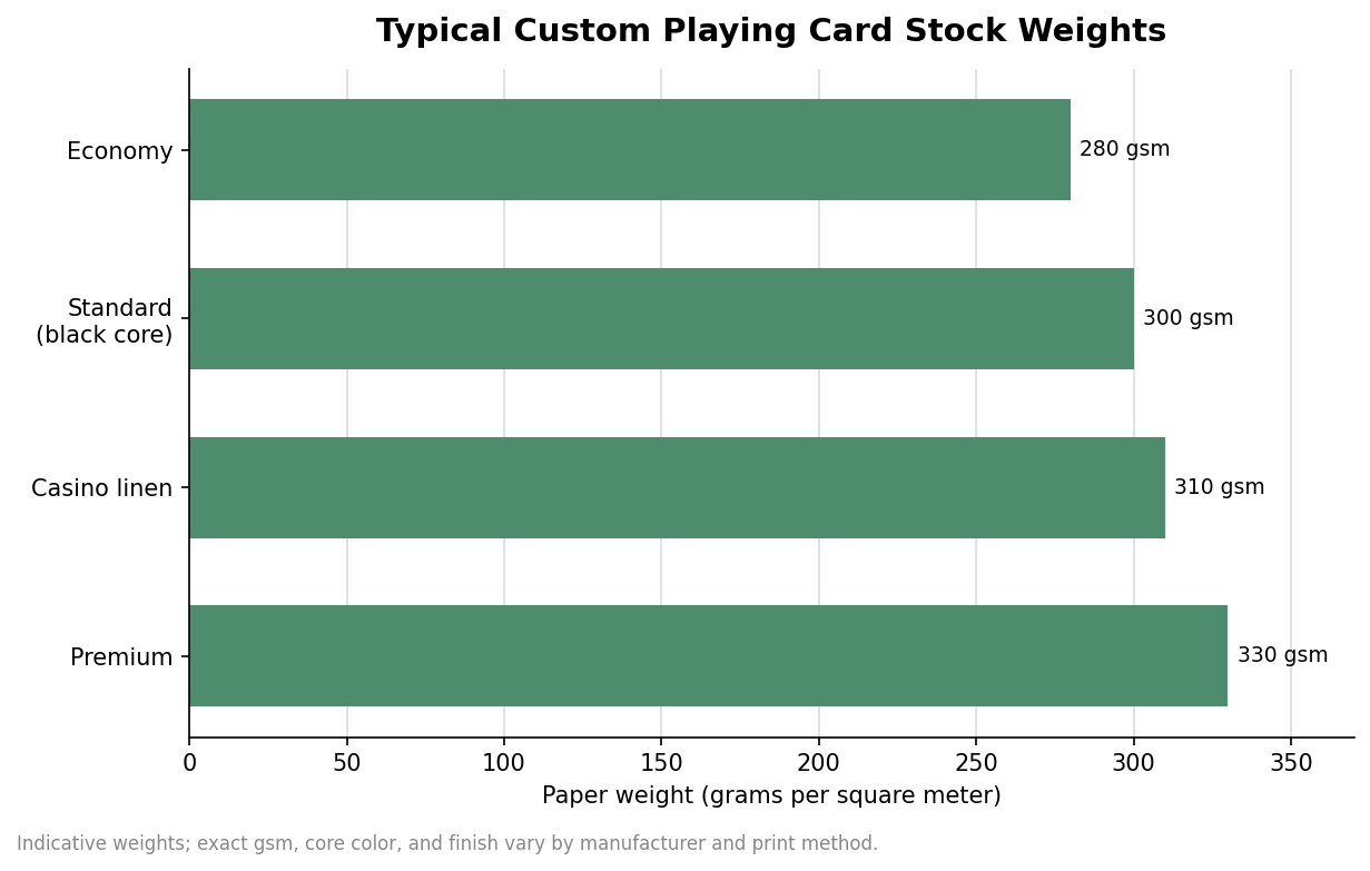
Card stock is measured in grams per square meter (gsm), and the number tells you how stiff and durable the card will be. Economy stock runs around 280 gsm, the most common standard sits near 300 gsm, casino-grade linen stock is often 310 gsm, and premium options climb to about 330 gsm. Heavier stock gives a crisper snap and shrugs off bending, but very stiff cards can feel harder to spring or bridge during a fancy shuffle, so heavier is not automatically better for every player.
The detail buyers overlook is the core, the hidden middle layer glued between the two printed faces. A black core is the most opaque option: it blocks light so the printed face cannot be read through the back of the card when someone holds it up to a lamp. That opacity is why black-core stock is standard for serious gameplay decks. Blue-core stock is slightly less opaque but perfectly adequate for most promotional and casual decks, and it usually costs a little less. If the deck will actually be played competitively, specify a black core; if it is a giveaway that mostly gets looked at, a blue core is fine.
Finish: linen texture vs. smooth coat
Linen finish presses a fine crosshatch texture into the card surface. Those tiny ridges create air pockets that reduce friction between cards, which makes riffle and overhand shuffling easier, improves separation when dealing, and helps hide the scuffs that come with heavy handling. The texture also diffuses glare under bright light. It is the default for poker and casino decks and for anything that will be shuffled thousands of times.
Smooth finish is flat and uniform, so ink sits on an even surface and fine details, gradients, and photography render more crisply. That makes it the better pick for promotional decks, brand marketing, event giveaways, and art decks where the imagery is the point. The trade-off is handling: smooth cards can stick together slightly in humid conditions and tend to show edge and corner wear sooner than a textured surface. Choose smooth when the deck is meant to be admired more than grinded through nightly play.
Two smaller specifications sit on top of the finish and are worth deciding on purpose rather than by default. The first is coating: a protective varnish or film that governs how slick the cards feel and how well they resist moisture and fingerprints, with matte coatings cutting glare and gloss coatings pushing color saturation. The second is the corner radius. Standard decks use rounded corners because sharp corners fray and peel with handling, and a rounded corner also feeds more cleanly through the hand during a shuffle. Neither choice is expensive, but both affect the feel of the finished deck, so it is worth naming them in your specification instead of accepting whatever the shop runs as its house default.
How to specify a deck that matches its use
The cleanest way to make these calls is to start from how the deck will be used and work backward. A gameplay or casino-style deck points toward poker size, 300 to 310 gsm, a black core, and a linen finish. A promotional or collectible art deck usually wants poker size for the larger canvas and a smooth finish for crisp artwork, with a black core added if people will genuinely play with it. A traditional card game built around large hands leans toward bridge size. Once the card is settled, confirm the tuck box and artwork setup with your printer before you approve anything: most custom decks ship in a standard tuck box sized to the card, and face artwork typically needs roughly a 3 mm bleed with a comparable safe margin so nothing important sits near a cut line. Minimums, lead times, and per-deck pricing vary by shop and print method, with short-run digital printing suited to small quantities and offset runs rewarding larger orders with a lower unit cost, so treat any single quoted figure as indicative until your supplier confirms it against your exact stock, finish, and order size.